UI CASE STUDY:
A real estate responsive web app that provides property buyers with information on properties of interest.
My Role: UI Designer - Student Project (user flow, wireframes, visual design, mockups)
Timeline: 3 weeks
Tools: Figma, Photopea
PROJECT OVERVIEW
Real estate investment is an increasingly popular way for individuals to achieve financial security. It is an exciting and emotional experience, but often complicated. Often, new-to-the-market buyers may struggle to get started without professional guidance. They need access to reliable, uncomplicated information about their potential property investments and get a feel for a place by viewing comprehensive information about the property and its neighborhood before spending time on-site.
HomeSweetHome will help new homebuyers or first-time investors navigate the complicated process of assessing and buying property. This website will allow users to view the properties that fit their budget, goals, and lifestyle and provides them with the expertise needed to get started efficiently.
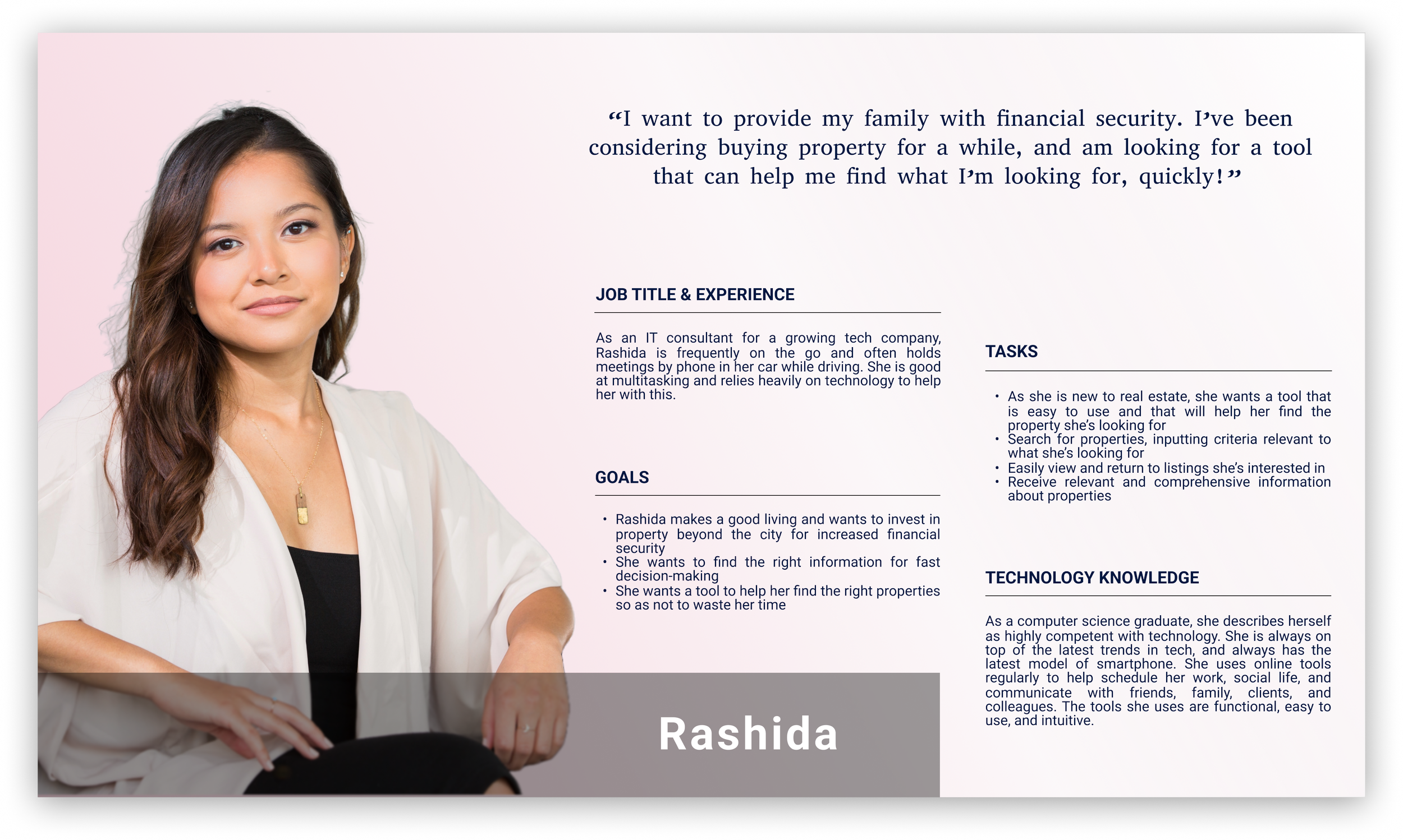
PROTO-PERSONA
USER STORIES
As a user, I want to create a profile containing all my property criteria, so that I am recommended results most relevant to me.
As a user, I want to be able to search and filter properties, so that I can find good matches based on my needs.
As a user, I want to be able to save or mark properties I am interested in so that I can easily revisit them.
As a user, I want access to as much written and visual information as possible about properties I’m interested in so that I can make an informed decision.
As a user, I want to be able to contact the right people if I am interested in viewing a property so that I schedule a viewing.
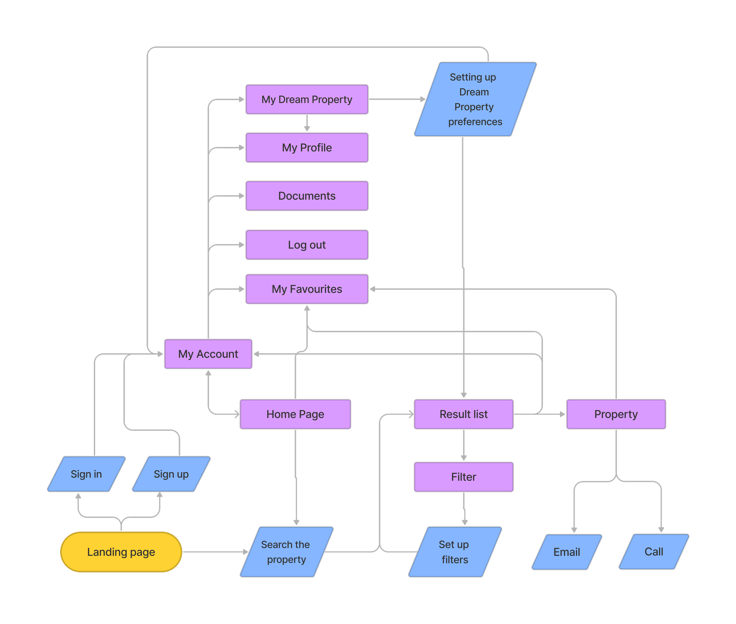
USER FLOW DIAGRAM
I created a user flow diagram demonstrating where the user would need to go within the website to complete the main tasks outlined in user stories, as well as other secondary tasks.
LOW FIDELITY WIREFRAMES
At first created with a pen and paper quick lo-fi wireframes that could be changed easily and then I created mid-fidelity wireframes with more details.
MID FIDELITY WIREFRAMES
Next step, to better convey the form and the function of the app I started to transform the wireframes into mid-fidelity, adding detail, such as basic UI elements, text, etc.
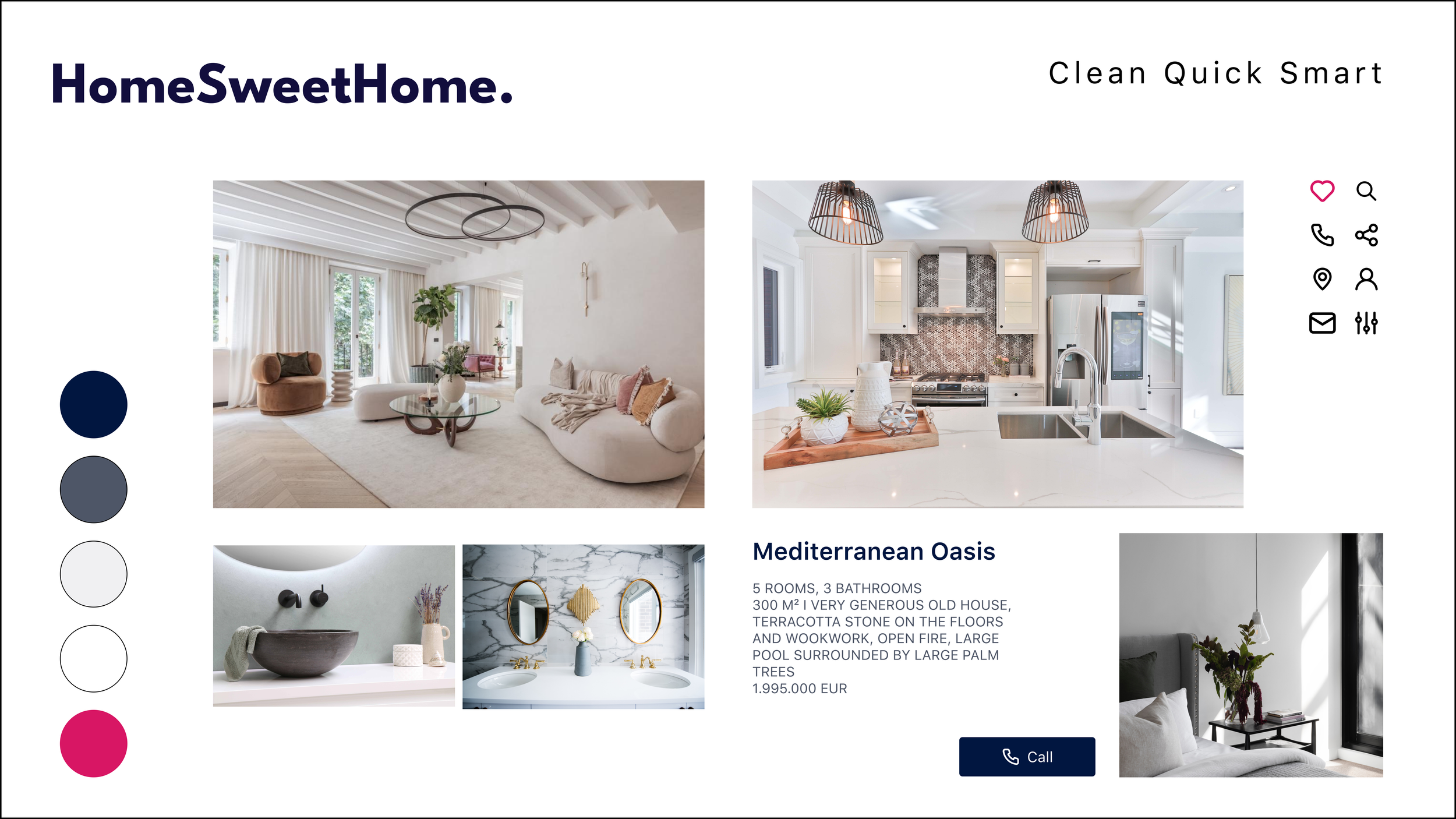
MOODBOARD
A mood board was created. It is serious, transparent, grounded, and modern but in a traditional stable way. A website like that will evoke a feeling of awe, aspiration, and desire. It will make visitors feel captivated by the elegance and opulence of the properties showcased, leaving them with a sense of admiration for the lifestyle being presented. This color palette will create a calming and inviting atmosphere, which will make visitors want to spend more time exploring the site and its offerings.
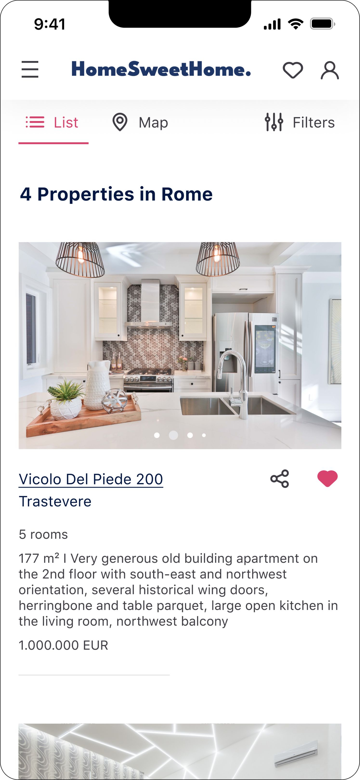
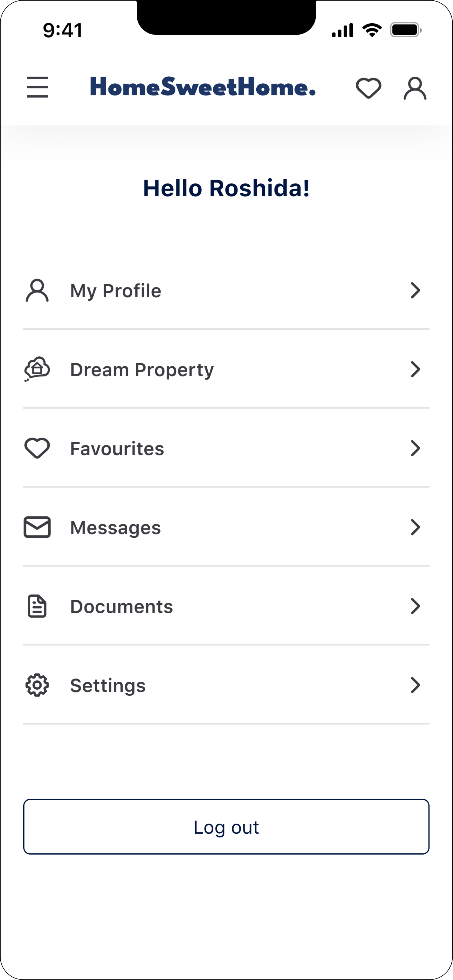
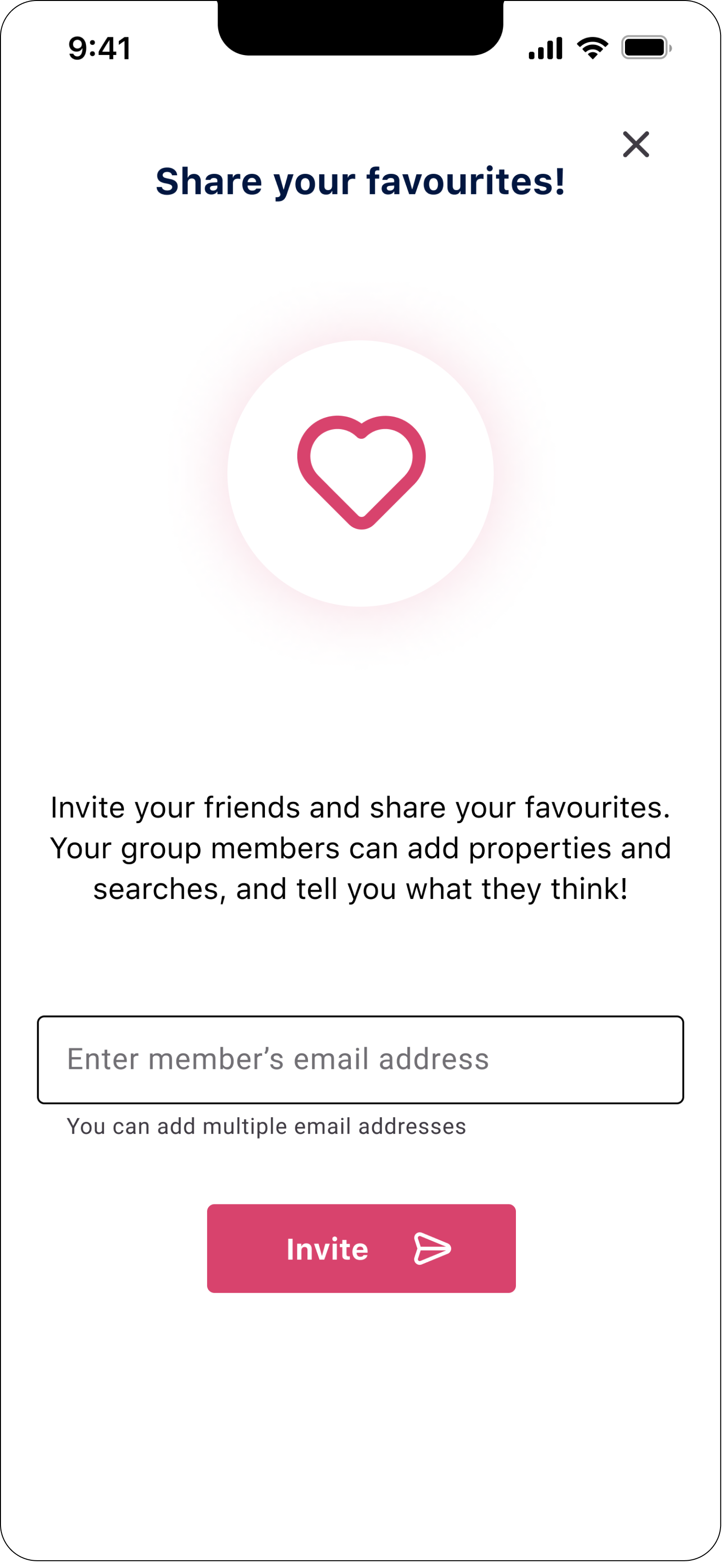
SET OF HIGH FIDELITY WIREFRAMES
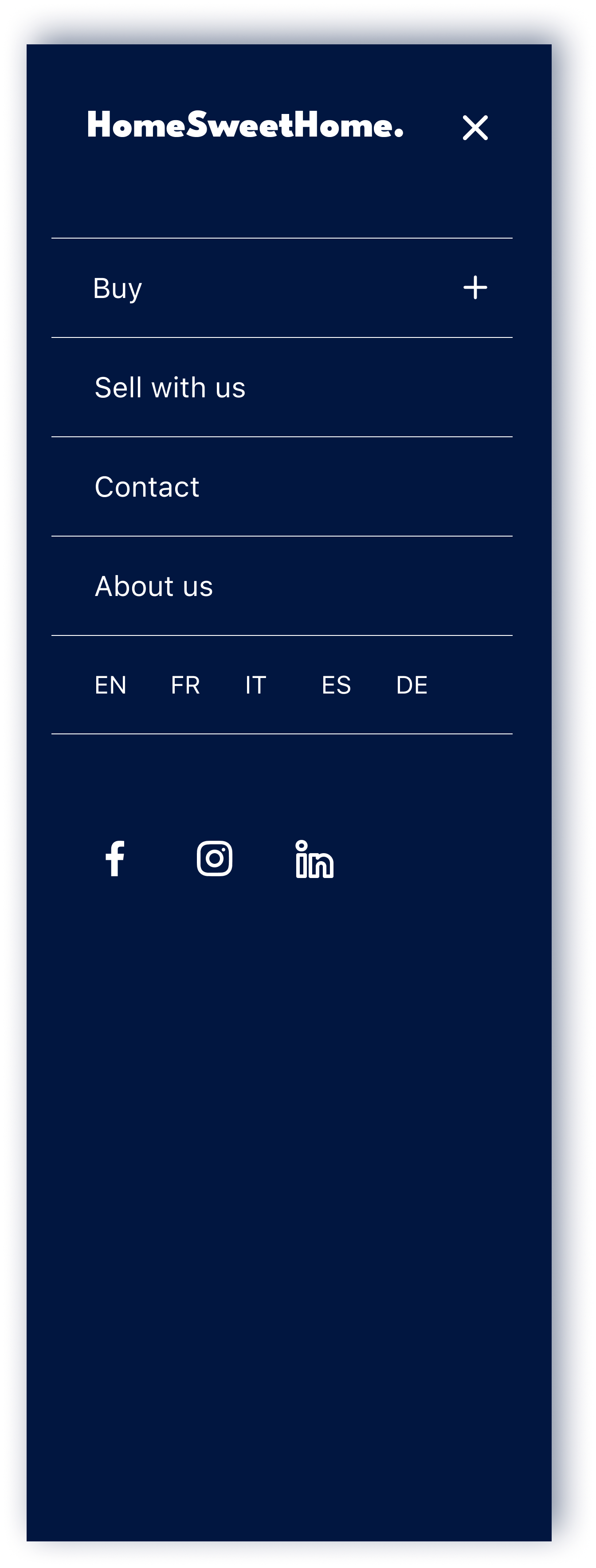
RESPONSIVE DESIGN


